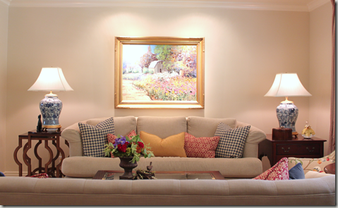
My client’s biggest complaint about their living room before was that no one ever spent time in there. During family gatherings everyone huddled in the kitchen and small family room, leaving the room next door empty and underused.
I could see why…First of all there was no focal point in the room. Second of all, the seating arrangement was awkward and uninviting. We spent the first few appointments working with templates like the one below. We moved the furniture around until we had optimized seating and created some wonderful focal points around the room.
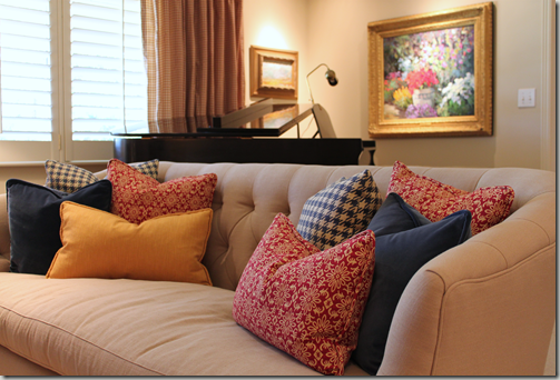
Then we went to work selecting fabrics and furniture to fit their traditional yet comfortable style. This painting, by Kent Wallis, was already part of their collection, so we pulled colors and inspiration from it.
We recovered a couple of pieces. The fun chair below was one of the first pieces of furniture that my clients purchased when they were married over 37 years ago.
Before
After
It is most defiantly everybody's favorite part of the room. The chair, draperies and pillows provided the punch of color and pattern that we needed. Next, we created two focal points on the wall below. The new English secretary is the first piece of furniture you see when you walk in the room. It is gorgeous and so is the new painting by Steve Songer.
The long narrow room was broken up into two areas. The piano area sits behind the sofa and across from the secretary. Another fabulous Kent Wallis painting was selected for this part of the room.
The Ralph Lauren Foo Dog lamps were the perfect finishing touch and my clients had to have the honeycomb bee box as well. We do live in the beehive state after all.
As their new furniture arrived, my client’s children (all grown and decorating their own homes now) would “dibs” the pieces they wanted to be passed down to them in the future. I started doing the same thing…and “dibsed” these Baker nesting tables!!!
It is all in good fun. But don't you think they are a must have??? My clients have happily reported that the room is finally getting the use it deserves. They admit that it isn't just when company is over either. They say that they are using the room more themselves.
For me design is about so much more then simply selecting beautiful furniture and finishes. It really is about improving the quality of life. For this client, that meant figuring out how to make the living room more inviting and serviceable for their family. Rather then adding on to their home – we found a way to make the square footage they already had a place that is fun, interesting, and accommodating to their lifestyle.
If you are interested in exploring ways to make your home work better for you, please contact me at Bethany.Christensen@gmail.com or 801-673-2845 for rates and availability.


4 comments:
The photos are good, but it doesn't nearly do the room justice. It is the funnest room, and I'm still dreaming of that fun chair. Can I put my dibs on that one? The whole combination of the room was flawless, and you really are so talented. It wasn't too stuffy that you couldn't touch anything, I wanted to sit down and talk to the owners, very cozy. Way to go!
You did a fabulous job! I'm sure your clients are loving it!
I am loving what you did Bethany!! That chair really is the greatest. Good job!!
So relaxing, I want to go sit in that room, and curl up wtih a fab book, or better yet have a family gathering. Great job B. You are fantastic!!
Post a Comment