Showing posts with label Kitchens. Show all posts

Tuesday, June 1, 2010

This is why I love to design…

One of my favorite quotes about interior design is by Windsor Smith. In an interview with Brooke Giannetti on her blog, Velvet and Linen, She said:

“We are the navigators of energy. Nobody really decorates because they love beautiful fabrics. It’s really about improving quality of life.”

022

This is so true. And the reason why I love to help people with their homes. There are so many possibilities within the space you already have that can improve the way you live. And it isn't just about making it pretty. To me a functional space is just as beautiful as a mountain of luxurious pillows.

When I designed my kitchen and island, I imagined it to be a gathering, eating, and art project creating place. It is so great when the house in my mind becomes reality and the kids are all gathered around the island doing a project!

I hope your summer is starting off great!

Saturday, March 13, 2010

Do you want a bigger kitchen?

I recently met Steve Tiek, of Tiek Built Homes, though a mutual friend. It turns out we have a lot in common. We both live along the Wasatch Front here in Utah and we both love timeless architecture, functional spaces, and detailed craftsmanship. He is a general contractor with a great eye for design. Turns out we are both big fans of Benjamin Blackwelder Cabinetry as well, see my post here and here.

Steve and Benjamin recently completed this stunning kitchen remodel. (All photos are posted with permission from Steve). Here is a photo of this space before. SMALL!

As you can see they removed the wall between the kitchen and the rarely-used-formal-dining-room in order to accommodate a bigger kitchen. The family now uses the large kitchen and adjoining eating area as the main dinning/entertaining space.

Photobucket

If you are tight on space, this is a great solution, since most parties gravitate into the kitchen anyway and most family meals are served in the kitchen eating area, why not eliminate the dining room?

Photobucket

This is the old formal dining room space. They left the large window in place which, Steve pointed out, let in a ton of light but also eliminated awkward corner cabinets. I love it!

Photobucket

What a beautiful place to stand and do dishes. I love that they left space between the cabinets and the window for the great light fixtures. The black granite looks like it is honed which makes it look a lot like soapstone (but with out the bigger pricetag)

PhotobucketPhotobucket

Steve explained that they wanted to have two focal points, the sink and the range/hood. But since the two were a bit far apart, the prep sink was added in the island.

Photobucket

Ahhh, the coveted island. You just gotta have one. There is nothing like sitting your little kids up to the bar and feeding them grilled cheese sandwiches. Because this space is narrow, Steve and Ben, came up with this zig, zag shape that not only adds interest to the room, but accommodates two kiddos and a prep sink. It is marvelous.

Photobucket

I love all the details!! Thanks for sharing your photos!

Monday, February 22, 2010

Style in Utah: Benjamin Blackwelder Cabinetry

Thanks to Gina of Willow Decor for sending the name of the craftsman responsible for the beautiful home in Alpine, Utah, that I featured last week: Benjamin Blackwelder Cabinetry. I would love to collaborate on a future project!

More eye candy below…

image

image

image

Click here or here to see more of his amazing work.

Wednesday, February 17, 2010

Does your home have good bones?

image

I create my own homes one layer at a time. It surprises some people that even though I have lived here for 18 months, I still don’t have pictures hanging on my walls or even an accessory to speak of. I am not to that layer yet and for some reason it just doesn't feel right to gussy up the tables when the rugs are all wrong. I like nothing more then to be able to start a home from scratch and complete it one perfect layer at a time.

image

The truth is that most homes develop over time. Very few of us can afford to move into a new home with new furnishings and accessories all at once. The first layers of a home are so important because they lay the foundation for what is to come.

I love this home showcased on Willow Decor. First of all, it is in Alpine, Utah, which is my neck of the woods. Second of all, it has such great bones.

image

Can you believe this view? Location is the very fist layer of your home. This is the one thing you can’t change!!!  It dictates so much about what your home can and will become. A great neighborhood, the perfect setting, mature trees, and spectacular views all contribute to the ambiance of your home. The surrounding homes also play an important roll in how big or small your home can become and the style that will work within your neighborhood. 

image

Your floor plan is the next layer  –  A good floor plan is flexible, and reflects the way you want to live. It works as well for 2 people as it does for 20. Although it is hard to see from these pictures, this home appears to have a wonderful flow and very practical spaces. Most importantly, a good floor plan has a seamless connection to the outdoors. Wouldn’t you love to watch the sun rise on this balcony?

image

Fixtures make up the third layer – this includes everything that is bolted onto the house. Flooring, trim work, light fixtures, cabinets, countertops, plumbing fixtures, appliances, railings, fireplaces, …I am sure I forgot something.

image

I love the choices this homeowner made. You can see how much thought and detail they put into this house from the hardwood floors to the reclaimed beams and coffered ceilings. It is so beautiful – even without a single piece of furniture, accessory or picture on the wall. 

image

This is what “good bones” look like to me. The cabinets are to die for. Apparently the homeowner is a cabinet maker.

image

Willow Decor gives a much more in depth tour of the home here. If you are in the market for a beautiful home in Alpine, Utah, contact me and I will put you in touch with the best Realtor in the Salt Lake Valley (my mom!!!) or click here.  

image

Or if you are getting ready to build or remodel a home I would love to help you think through the foundation layers and select the perfect fixtures to complete each space.

Where ever you are in the process of creating your home remember that it is a process and don’t get discouraged. Each decision is important and will play a roll in the ambiance and beauty of your home.

Sunday, January 10, 2010

Custom white kitchen makeover before and after!

Oh how I love your emails and comments! Thanks to everyone who reads, comments, and sends emails. Melissa is a great friend of mine from Connecticut. We both live in Utah now but only see each other on rare occasions, life! Melissa and I had a fun time decorating our townhouses together in Connecticut and harvesting our hydrangeas each fall for arrangements. I was happy to see from a photo on her blog that she has planted a pee gee limelight hydrangea in her new yard. I have one too!

Melissa has been been out house hunting and sent me an email explaining that while she loved the kitchen in this house….

IMG_7102

She made on offer on the house with the kitchen below. She wanted to know how to accomplish the look of the home above with what she already had….It is interesting to think that these two kitchens started out exactly the same!LLDesign

While she wasn’t really asking me about the kitchen, I wanted to point out the brilliant changes that the owner/designer of the white kitchen made to totally change the look of the kitchen from “standard builder issue” to a Christopher Peacock inspired look.

No. 1 – Obviously, the owner/designer painted the cabinets white. I have used every method under the sun to paint cabinets. If you can afford it, hire a cabinet company to do the job. The paint they use is the most durable and will hold up better then what you or your painter will use. If that is too expensive, spray paint them yourself. BUT follow these instructions carefully – not all white spray paint is created equal. You must use the right color white. Plain old bright white will look cheep or like the cabinets have only been primed. I just spray painted all of my laundry room cabinets white and the result is awesome! I was shocked at how professional they look.

image

I used Krylon Dover White in a gloss finish. Dover white is a little bit creamy without being too creamy. It is also the exact color of all the trim on my house (Sherwin Williams Dover White) so I didn’t have to have the spray paint custom mixed. If Dover White is not the right white for you, Sherwin Williams will make spray paint in custom colors. So pick a yummy white and go for it! I also love Shoji White by Sherwin Williams. (I only lightly sanded the cabinets and then sprayed away! No primer needed.)

No. 2 – Two schoolhouse light pendants replaced the existing light fixture. I found this one for $126.00 on Amazon.com.

image

No 3. I love the creativity where the counter tops are concerned. The island has been redone in carrera white marble 12X12 tiles. Obviously marble slab tops were not in the budget – but this owner/designer did not let that stop her. Tile counter tops can be done fairly easily by yourself thus cutting the costs tremendously. In the process they enlarged the island so that there is seating on two sides rather then just one- smart!

image

No. 4 The rest of the counter tops are plain white ceramic tiles with a fabulous trim piece for the bullnose. And the backsplash is done in good old white subway tiles. I really like the way they used the trim piece here.

image

No. 5 Four of the cabinets doors have been turned into glass fronts. It looks like they just took the cabinet panel out and had a piece of glass made to fit. It really adds to the open airy feeling of the white kitchen and also gives a nice focal point to the room. Looks like this owner/designer also has a thing for peegee lime light hydrangeas. We must all be kindred spirits.

No. 6 The microwave has been removed and a new stainless steel hood has taken it’s place. So much better!!! Again the focal point is no longer a microwave but four accessorized glass front cabinets and a stainless steal hood. Not bad.

image

No. 7 The panel above the cabinets has been removed giving the room a more spacious open feeling.

No. 8 The walls were painted a wonderful pale green color that compliments all of the green dishes. And the pantry door was given wider trim as well as new glass inside.
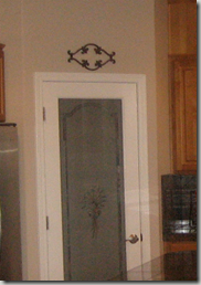
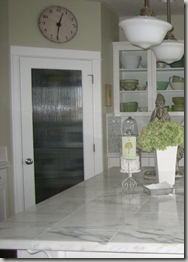
image image

No. 9 Hardware has been added to the cabinets! I almost forgot to point that out. They are little crystal knobs and pulls.

image

What a great makeover. Thanks Melissa for sharing these photos with me!!! I hope to post about the furniture next (since that was what you were really asking me about, LOL). See it again one more time. Did I miss anything???

Before:

LLDesign

After:

IMG_7102

That was fun. Who is ready for a kitchen makeover. Contact me if you are interested!!!

Tuesday, November 10, 2009

Harman Wilde Interior Design – Style in Salt Lake City

I am really excited to share this home with you. It is one of my favorites and was published in the Utah Style and Design Spring 2009 issue. It was decorated by the Harman Wilde Interior Design Team, Sue Harman and Jason Wilde. Be sure to check out their website to see more amazing spaces.

The photos have been taken from the designer’s website with their permission.

scan0013

AFTER! Quaint, charming, and full of character. Wouldn’t we all love a front porch like this one. Talk about curb appeal!

scan0014

You can see how much potential this home had from the beginning!

cottage industry living

What I love…It has a playful mix of pattern, texture, and color that manages a sophisticated and relaxing feel at the same time. I also like the way they paired geometrics, like the Kelly Wearstler Imperial Trellis fabric on the roman shades, with florals and stripes on the chairs and sofa.

cottage industry kitchen

Ahhhhh, a beautiful white kitchen with limestone countertops and simple lines. Perfection. The top halves of the cabinet doors look like true-divided glass which gives a nice open feeling to the room. But since they left 3/4 of the cabinets out of sight – the homeowner has more storage space and less display space. I would like that.

cs10

While I don’t know the exact square footage, I think that this “cottage” it is much bigger then it looks. Are we starting to see a trend away from bigger open floor plans and toward smaller more intimate spaces?

cottage industry

cottage industry master

cs7

This master bathroom is a nice departure from the all white spaces we are seeing so often these days. Don’t get me wrong, I love them too! But I could really go for this fun combination of granite and glass hexagonal tiles.

cottage industryguest

cottage industy bedroomThese great bedrooms have lots of charm and just the right amount of color, pattern and texture!

pool

I left the best for last. This home really has everything. I love their updated fresh take on cottage style. What did you think?

Tuesday, October 27, 2009

A well designed home never goes out of style!

Let’s face it – styles change. What is new and fresh today will become dated and passé tomorrow. Things That Inspire wrote a great post, this week, about Trendy elements that scream 2000s. The post was thought provoking and so were the comments that followed. It made me think, “what is timeless?” and “how can I ensure that my designs stand the test of time?”

scan0010

All photos - Country Home Sept 2000 – Designed by Ginger Barber

For many people it is scary to embark on the world of interior design – whether they are building, remodeling or simply purchasing a new sofa – the fear of making a mistake can be paralyzing. But what fun is that? A well designed home is not afraid of taking risks. That is rule #1. So take a deep breath – “it is just paint it is just fabric so relax and have fun” quote by Andrea Lambert in Mary Engelbreit's Home Companion.

scan0006

I dug deep into my files to find a home that I think is timeless. It was published nine years ago (that is forever in the design world!!) in Country Home Magazine September 2000. It was the home of designer, Ginger Barber. I also came up with some ideas about what a well designed home should incorporate. See what you think!

scan0003

#2- A well designed home is authenticnot false or copied; genuine; real.

Project1

#3 A well designed home is craftmanship – Quality pieces will add depth and character to a room. Antiques create an authentic feel and have usually stood the test of time in quality and design.

scan0008

#4- A well designed home is flexible and functional- If you haven’t already read the Cote de Texas post about Ginger Barber’s two more recent homes. Click here. You will see many of the same pieces of furniture travel from home to home. Point made!

scan0009

#5- A well designed home is simple – Leonardo de Vinci said, "Simplicity is the ultimate sophistication". I agree.

scan0011

#6- It is all in the details- It is the texture of a basket, the motion in a painting, or just the right shade of yellow. But the details make all the difference, don’t you think?

I would love to hear your thoughts on the subject. What is #7?

LinkWithin

Related Posts with Thumbnails