I am a little bit sad to post these photos because it marks the end of a really fun project. It all began with a one hour consultation about bathroom tile and the next thing you know we are redecorating the entire house. In the process we became great friends (my favorite part of the job) and I will really miss our weekly meetings.
This is how the family room looked BEFORE:
My clients were frustrated with the space because it was so cramped, especially when they had large family gatherings and everyone wanted to be in this one room. The space is long and narrow which called for a longer sofa and smaller scaled chairs (the opposite of what was there). So this is what we did!
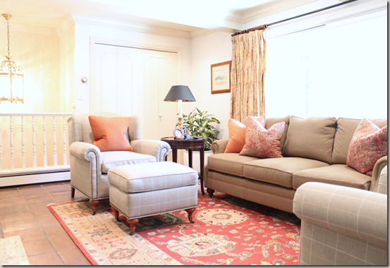
By replacing the furniture with properly proportioned pieces, it made the room feel much bigger. We created additional seating on the sofa and ottoman, (which can be used in a pinch). We originally planned on two ottomans but my clients loved the rug so much they didn't want to cover it up. Adding three extra seating options was A LOT for this size space.
You can see the drapery fabric behind the sofa. It was the only element in the room that had to stay, which was fine with me because I love the classic Ralph Lauren print (it provided us with the perfect springboard for the project). The room is right off of the kitchen and breakfast area so it gets a lot of use. All of the fabrics that we selected are very grandchild friendly with high durability and camouflage factors. The herringbone fabric on the sofa is a Ralph Lauren fabric as well as the beautiful wool paisley pillow on the right. A Pindler fabric was selected for the club chairs and tangerine pillow.
Here is another view of the seating arrangement, which faces a fireplace with a flat screen above.
We were all so happy with how the room turned out and my clients have reported that their family gatherings are much more comfortable, thanks to the new furniture! If you would like help creating a properly proportioned, child friendly room, contact me; bethany.christensen@gmail.com


5 comments:
i can't believe that is the same room - what a beautiful transformation! you are so talented!
love love love, and your photos are great!
Oh that room turned out so beautiful!Great job!!
Bethany it looks great!
Wow! That is an amazing transformation! Bravo!!
Post a Comment