I recently met Steve Tiek, of Tiek Built Homes, though a mutual friend. It turns out we have a lot in common. We both live along the Wasatch Front here in Utah and we both love timeless architecture, functional spaces, and detailed craftsmanship. He is a general contractor with a great eye for design. Turns out we are both big fans of Benjamin Blackwelder Cabinetry as well, see my post here and here.

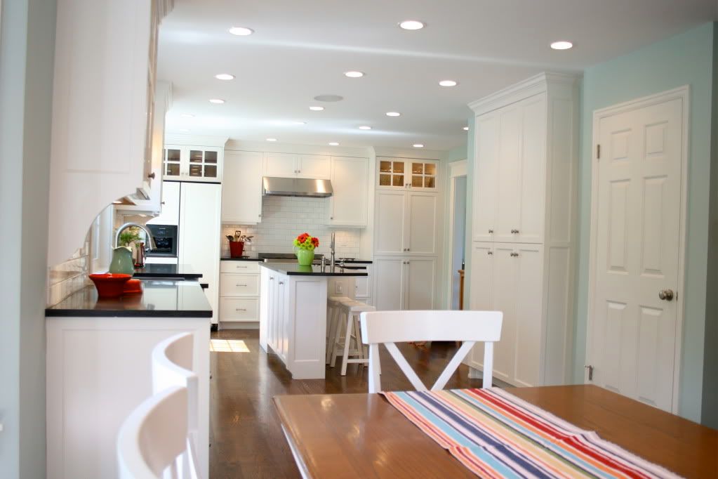
Steve and Benjamin recently completed this stunning kitchen remodel. (All photos are posted with permission from Steve). Here is a photo of this space before. SMALL!

As you can see they removed the wall between the kitchen and the rarely-used-formal-dining-room in order to accommodate a bigger kitchen. The family now uses the large kitchen and adjoining eating area as the main dinning/entertaining space.
If you are tight on space, this is a great solution, since most parties gravitate into the kitchen anyway and most family meals are served in the kitchen eating area, why not eliminate the dining room?
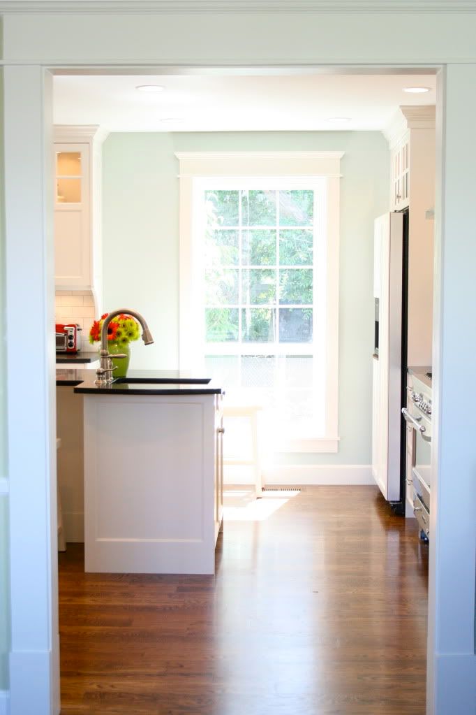
This is the old formal dining room space. They left the large window in place which, Steve pointed out, let in a ton of light but also eliminated awkward corner cabinets. I love it!
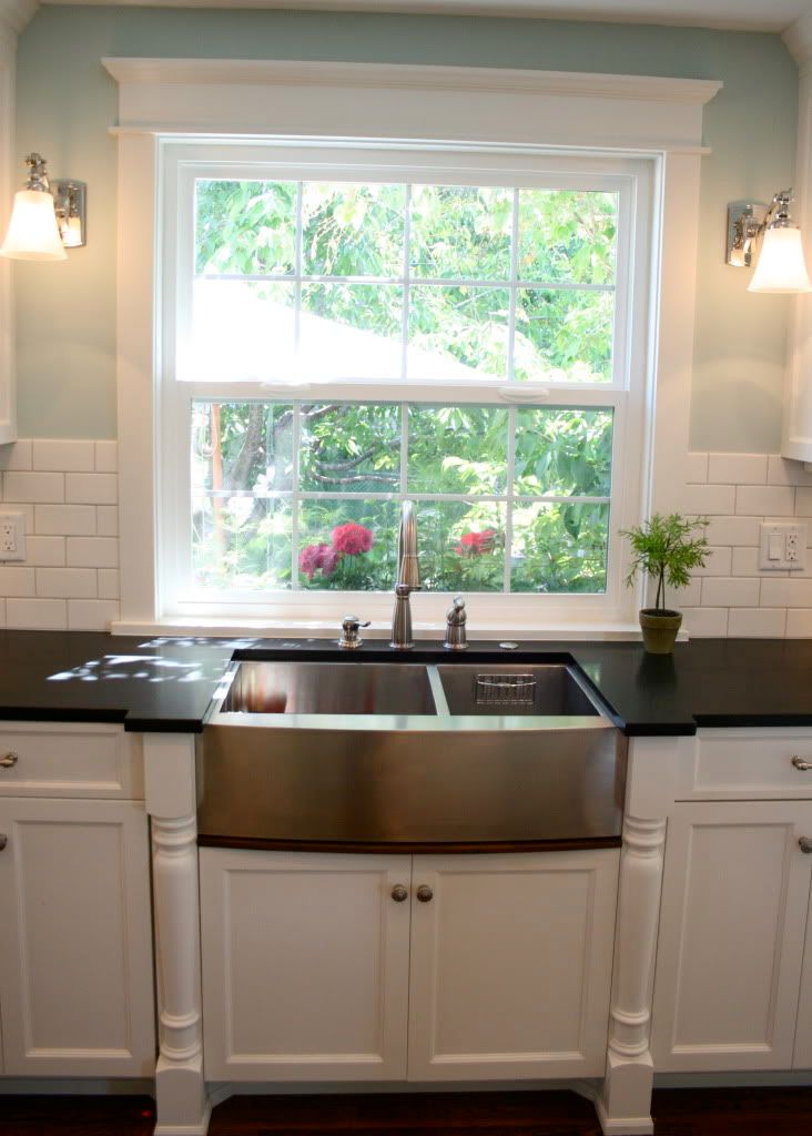
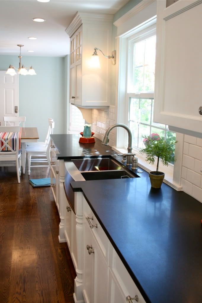
What a beautiful place to stand and do dishes. I love that they left space between the cabinets and the window for the great light fixtures. The black granite looks like it is honed which makes it look a lot like soapstone (but with out the bigger pricetag)
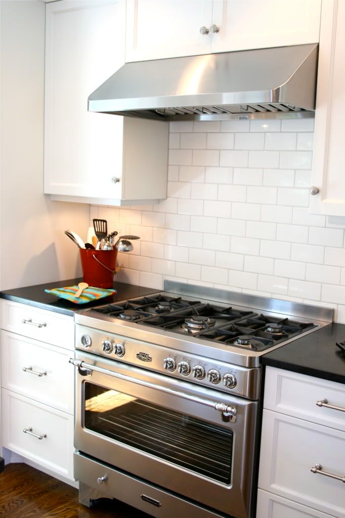
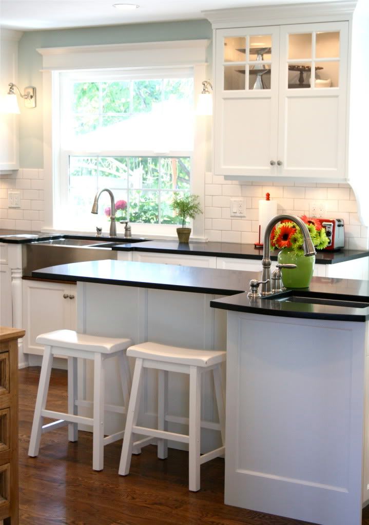
Steve explained that they wanted to have two focal points, the sink and the range/hood. But since the two were a bit far apart, the prep sink was added in the island.
Ahhh, the coveted island. You just gotta have one. There is nothing like sitting your little kids up to the bar and feeding them grilled cheese sandwiches. Because this space is narrow, Steve and Ben, came up with this zig, zag shape that not only adds interest to the room, but accommodates two kiddos and a prep sink. It is marvelous.
I love all the details!! Thanks for sharing your photos!


7 comments:
Would love a kitchen like that.
Love the post! It would be a dream to have you and Steve working together for me on a house. Hopefully soon!
Eye candy! Thanks for sharing.
That's a beautiful kitchen! I love his attention to detail! Thanks for sharing.
Wow what gorgeous kitchens. Ours is on the small side, but we changed the layout by removing a peninsula and making it an island, turning it 90 degrees.... the flow is so much better now and even though its not larger, it seems much more expansive. The best part is: its so functional and multiple cooks can be there at the same time. Great post!
I was just thinking I would love a kitchen like this!
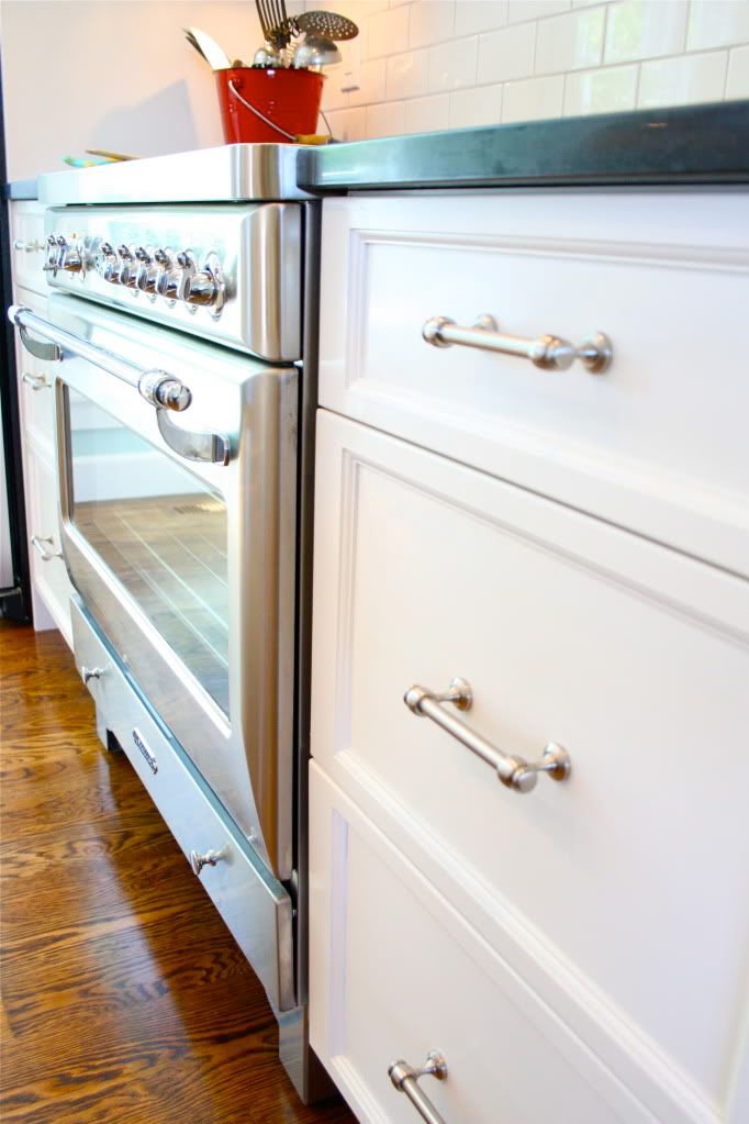
Truly amazing remodel. Love the stove area, and the workmanship is terrific.
Post a Comment