I posted the question a while back…Is it better to wait, save your money, and splurge on one fabulous item at a time; or decorate on a dime and find creative ways to furnish your home without spending a lot of money? I came to the conclusion that a well designed home must carefully balance the two.
This is where my client and I began almost exactly a year ago. See how we transformed her dining room by splurging on some things and saving on others.
Before:
My client loves to decorate and has a charming cape cod home. She called me to help her pick paint colors. Of course we didn’t stop there, a couple of months later she was ready for the next layer. In an email she said that she hated the window treatments (2”blinds) and that she needed some color, personality and pattern on her walls. I couldn’t wait to get to our appointment to recommend ROMAN SHADES – which would solve all of her problems and be the perfect window treatment in her kitchen, family room, dining room and study.
So this is where we splurged…Custom Roman Shades were made for her dining room and study. The windows were cased with beautiful white trim.
We searched and searched for the perfect fabric. At one point a sample of Kelly Wearstler’s Imperial Trellis fabric came home with us. It was so perfect except for one thing, the price tag!!!! So we went back to the showroom and found this trellis fabric from Pindler at a fraction of the price. We loved it just as much.
This is where we saved: Less expensive designer fabric for the custom roman shades.
In the meantime, my client found the dining table at Down East Home, here in Salt Lake City (our Pottery Barn outlet) and the two additional captains chairs at the Sundance Catalogue outlet. The rug and four parsons chairs are from the previous furniture arrangement.
Another place we saved: dining table and two captains chairs found at local outlet.
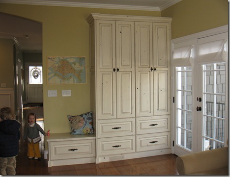
Another problem area in my client’s home was this “drop zone”. These French doors serve as the back door to the home and all of the coats, hats, shoes, and backpacks were becoming an organizational nightmare.

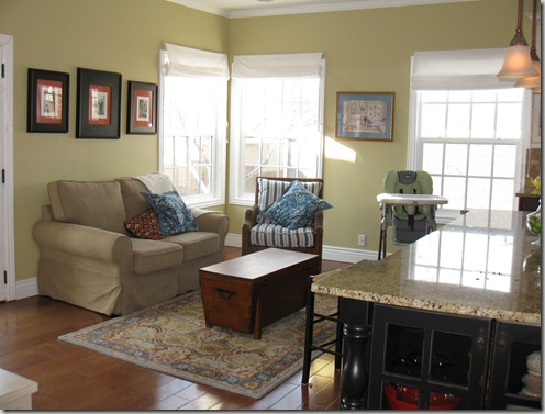
Another place we saved: You can see the new white roman shades that were purchased from the pottery barn for her kitchen/family room area. This was a great decision because we were going to use a white in-expensive fabric for the custom shades in here anyway. The quality and fit were a bit of a compromise but don’t they look great??
It is tough to know were to spend money and when to wait or find something temporary. I would love to help you put a plan together! Contact me for rates and availability. Bethany.christensen@gmail.com.


6 comments:
This is a fun/intriguing post. What colors did your client use? And did you paint the arch wall of the dining room the same color as the entrance? Or was it just the lighting of the photo?
Melissa- The color that I used in her living room/dining room and master bedroom is my all time favorite Sherwin Williams Pudding Mold. They no longer have this color on their deck but you can ask for it and they will make you up a sample for $5. It is really close to their color sea salt but it is a little bit better. The thing that I like about Pudding Mold is that it is a subtle and fresh. It is not a strong color even though it is a blue/green it really reads as a neutral. I can put almost any color with it. In some light it looks light blue and in some light it looks light green. I have used it in so many homes and people always say how perfect it is. And I agree. Sounds like I need to do another post about that color.
The yellow in the kitchen was a color that was there when my client bought the home so I don't know exactly what it is.
And I don’t think that we used a different color on the dining room arch- I will have to go back and look.
Bethany
Funny that you just posted this. I was just talking to my mom about the $200 I have wasted on trying to make romans shades (which didn't work) and putting up curtains (that don't look great). I really just need custom roman shades in a cute fabric like that. What is wrong with me???
Loving all the posts. And your photos look really good :)
Love these before and afters. And the Cannon kitchen is exactly what I need in my kitchen that needs to be completely gutted.
BTW, I used your paperwhite post as inspiration for a party favor for my twins' 1st birthday in December. I'll post on my blog in the next week and let you know so you can see the photos. Thanks for the inspiration!
Bethany,
I should have known it was pudding mold! Since seeing that in your old bedroom I have recommended it to several people. Both my sister and cousin have used it as their main color in their homes.
Post a Comment